Graph drawing - Wikiwand
The Key Differences Between Charts and Graphs Explained
Effective Data Visualisation - with Valentina D'Efilippo - YouTube
Foundations of Data Visualisation - Computerphile - YouTube
The Data Visualisation Catalogue ❗!important
Information is Beautiful
The Pudding visualized journalism
Explorable Explanations interactive learning
Blog About Infographics and Data Visualization - Cool Infographics
Telling stories with data using the grammar of graphics using R
Best R packages for data import, data wrangling & data visualization | Computerworld
Jake VanderPlas - How to Think about Data Visualization - PyCon 2019 - YouTube
The Grammar of Graphics (Statistics and Computing): Wilkinson, Leland, Wills, D., Rope, D., Norton, A., Dubbs, R.: 9780387245447: Amazon.com: Books
A Comprehensive Guide to the Grammar of Graphics for Effective Visualization of Multi-dimensional Data
A layered grammar of graphics
Data visualization · GitHub
fasouto/awesome-dataviz: A curated list of awesome data visualization libraries and resources.
shivkumarganesh/InfoVizGeek: List of tools and Utilities for Data and Information Visualization. Ever Expanding list with Insights into some of the most happening Frameworks.
5 Amazing Tips for Data Visualization - Towards Data Science
graphicalweb2014/public at master · mlarocca/graphicalweb2014 demo with Ractive and D3
Agile Visualization using Pharo
anvaka/ngraph: Beautiful Graphs
39 studies about human perception in 30 minutes — Medium
Introducing the Snail Chart - Nightingale - Medium
Book
jsDataV.is - Data Visualization with JavaScript
Introduction · Data Visualization for All
The Grammar of Graphics
Lightning
Lightning | Data Visualization Server
Server-client architecture, with Python, JS, Scala, R clients
Lightning + Jupyter - Jupyter Notebook Viewer
Python
Python Data Visualization 2018: Why So Many Libraries? - Anaconda
Top 6 Python Libraries for Visualization: Which one to Use? | by Khuyen Tran | Jul, 2020 | Towards Data Science
What Are the Best Python Plotting Libraries? | by Will Norris | May, 2022 | Towards Data Science
Introduction to Data Visualization in Python | by Gilbert Tanner | Towards Data Science
Overview of Python Visualization Tools - Practical Business Python
Choosing a Python Visualization Tool - Practical Business Python
Jake VanderPlas The Python Visualization Landscape PyCon 2017 - YouTube
Creating Dashboard to Visualise Data In Python - DEV Community 👩💻👨💻
Complete Guide to Data Visualization with Python - Towards Data Science
The 7 most popular ways to plot data in Python | Opensource.com
PYTHON CHARTS | The definitive Python data visualization site samples
Welcome to pycircular’s documentation! — pycircular documentation
Introducing PyCircular: A Python Library for Circular Data Analysis | by Alejandro Correa Bahnsen | Jan, 2023 | Towards Data Science
Wide vs. long data
Plotting in Python: Comparing the Options
Choosing one of many Python visualization tools | by Gabriela Moreira Mafra | Magrathea
5 Steps to Beautiful Bar Charts in Python | Towards Data Science
From data to Viz | Find the graphic you need
Visualizing In-App User Journey Using Sankey Diagrams In Python | by Nicolas Esnis | Towards Data Science
Notebook :: Anaconda.org large data, use hvPlot/HoloViews over Datashader
ResidentMario/missingno: Missing data visualization module for Python.
PyViz documentation
PyViz Tutorial
PyViz Topics Examples
PyViz: Simplifying the Data Visualisation process in Python.
Glue: multi-dimensional linked-data exploration
Glue documentation
piccolomo/plotext: plotting on terminal
Making Plots In Your Terminal With Plotext - PyBites
Home — VisPy
Visualize any Data Easily, from Notebooks to Dashboards | Scipy 2019 Tutorial | James Bednar - YouTube
pyecharts - A Python Echarts Plotting Library
pyecharts/pyecharts: 🎨 Python Echarts Plotting Library
RJT1990/pyflux: Open source time series library for Python
Welcome! — Toyplot documentation
sandialabs/toyplot: Interactive plotting for Python.
Holoviz
High-level tools to simplify visualization in Python — HoloViz documentation
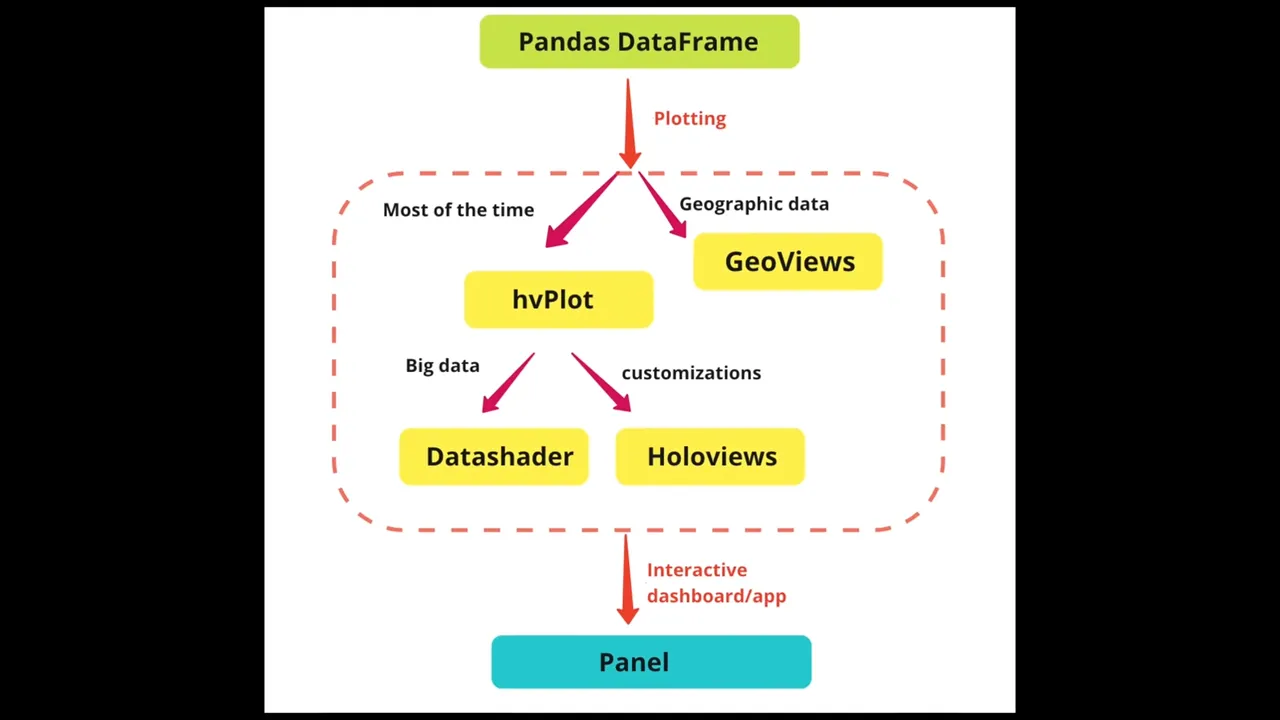
Datashader Accurately render even the largest data
HoloViews — HoloViews Datashader + Bokeh
hvPlot documentation
A high-level app and dashboarding solution for Python — Panel documentation
How to Create a Beautiful Python Visualization Dashboard With Panel/Hvplot - YouTube
Visualize any Data Easily, from Notebooks to Dashboards | Scipy 2019 Tutorial | James Bednar - YouTube 3:06:37, pyviz + holoviz
Visualization and Interactive Dashboard in Python | by Sophia Yang | Towards Data Science
Visualization and Interactive Dashboard in Python: My favorite Python Viz tools — HoloViz - YouTube
Big Data Visualization Using Datashader in Python | How does Datashader work and why is it so fast? - YouTube
Matplotlib
Matplotlib: Python plotting
Usage — Matplotlib documentation
User's Guide — Matplotlib documentation
Tutorials — Matplotlib documentation
API Overview — Matplotlib documentation
Matplotlib Tutorial Series - Graphing in Python - YouTube
Graphing in Matplotlib (chart generation) in Python - YouTube
Customizing Matplotlib Graphs and Charts - YouTube
3D Graphing with Matplotlib - YouTube
Matplotlib Tutorial - Tutorialspoint
A Beginners Guide to Creating Clean and Appetizing Python Charts
A Beginner’s Guide to Data Visualization Using Matplotlib
The Last Matplotlib Tweaking Guide You’ll Ever Need
Effectively Using Matplotlib - Practical Business Python
Beginner's Guide to matplotlib for Visualization and Exploration in Python
10 matplotlib Tricks to Master Data Visualization in Python
Precision data plotting in Python with Matplotlib | Opensource.com
Python | Basic Gantt chart using Matplotlib - GeeksforGeeks
A Simple Guide to Beautiful Visualizations in Python | by Frank Andrade | Apr, 2021 | Towards Data Science
Level Up with Python: Quickly Produce PDFs with Stunning Visuals | by Kate Wall | Feb, 2022 | Towards Data Science
Seaborn: statistical data visualization abstraction layer using Long Form on top of Matplotlib
Seaborn Tutorial - Tutorialspoint
Visual Storytelling with Seaborn - The Startup - Medium
Handy Data Visualization Functions in matplotlib & Seaborn to Speed Up Your EDA
Data visualization made simple in Python with Seaborn | Opensource.com
Plotting real-time data from Arduino using Python | HalfaGeek
Python Matplotlib (pyplot), a step-by-step Tutorial - Data Blogger
Visualization with Matplotlib | Python Data Science Handbook
Visualization — pandas documentation
Simple Graphing with IPython and Pandas - Practical Business Python
A Comprehensive Guide To Visualizing and Analyzing DICOM Images in Python
python - How to make IPython notebook matplotlib plot inline - Stack Overflow
python - matplotlib hooking in to home/back/forward button events - Stack Overflow
%matplotlib inline on first line of script to render graph in Jupyter
Bokeh
Welcome to Bokeh — Bokeh documentation interactive plots in HTML
User Guide — Bokeh documentation
Plotting with basic glyphs — Bokeh Documentation
Providing data — Bokeh Documentation
Styling visual attributes — Bokeh Documentation
Gallery — Bokeh Documentation
Making Interactions — Bokeh Documentation
bokeh.plotting — Bokeh Documentation
bokeh.models.sources — Bokeh Documentation ColumnDataSource
bokeh.colors — Bokeh Documentation
bokeh.palettes — Bokeh Documentation
bokeh.models.formatters — Bokeh Documentation DatetimeTickFormatter
Bokeh Tutorial - Tutorialspoint
How can Bokeh be used to generate sinusoidal waves in Python? basics
Data Visualization with Bokeh | Kaggle
Python | Data visualization using Bokeh - GeeksforGeeks
Interactive Data Visualization in Python With Bokeh – Real Python
Creating an interactive map in Python using Bokeh and pandas | by Craig Dickson | Towards Data Science
Easy Data Visualization Techniques with Bokeh | by Ilya Kvyatkovskiy | Towards Data Science
Interactive Bar Charts with Bokeh | by Ilya Kvyatkovskiy | Towards Data Science
Beautiful and Easy Plotting in Python — Pandas + Bokeh | by Christopher Tao | Towards Data Science
Visualizing Data with Bokeh and Pandas | Programming Historian
Interactive data visualization with Bokeh - Jupyter Notebook Viewer
Add interactivity to your Python plots with Bokeh | Opensource.com
Vector animations with Python - del( self )
phurwicz/hover: Never spend O(n) to annotate data again. Fun and precision come free.
Bokeh server
Running a Bokeh server — Bokeh Documentation
Server architecture — Bokeh Documentation
Embedding Bokeh content — Bokeh Documentation
Timezone
python - Bokeh time series plot annotation is off by 1 hour - Stack Overflow
datetime axis type not handling timezone correctly · Issue #1135 · bokeh/bokeh
Chartify
Welcome to chartify’s documentation! Built on top of Bokeh
spotify/chartify: Python library that makes it easy for data scientists to create charts.
Introducing Chartify: Easier chart creation in Python for data scientists
Examples - Jupyter Notebook Viewer
Tutorial - Jupyter Notebook Viewer
Pygal
Pygal — pygal documentation
Kozea/pygal: PYthon svg GrAph plotting Library
Creating Interactive Charts with Python Pygal | Pluralsight | Pluralsight
Python Programming Tutorials
Plotly
Plotly Open Source Graphing Libraries | | Plotly
Plotly JavaScript Graphing Library | JavaScript | Plotly
React Plotlyjs Index
Plotly Python Graphing Library | Python | PlotlyBuilt on top of plotly.js, interactive plots in HTML
Plotly Express | Python | Plotly abstraction layer using Long Form similar to Seaborn
Plotly Offline for IPython Notebooks
python_cheat_sheet.pdf
Plotly's Python API User Guide - Jupyter Notebook Viewer
Visualize and communicate uncertainties clearly with Python and Plotly
Simplify data visualization in Python with Plotly | Opensource.com
4 Reasons Why I’m Choosing Plotly as My Main Visualization Library | by Dario Radečić | Towards Data Science
Dash by Plotly - Plotly
Creating Interactive Visualizations with Plotly’s Dash Framework - Practical Business Python
Build a web data dashboard in just minutes with Python | by JP Hwang | Towards Data Science
Data Visualization GUIs with Dash and Python - YouTube
Getting Started With Dash: Easy Data Visualization In Python - Part 1/3 - YouTube
Building A Financial Dashboard In Python With Dash - Part 2/3 - YouTube
Improving The Software Design Of The Financial Dashboard - Part 3/3 - YouTube
Python Histogram Plotting: NumPy, Matplotlib, Pandas & Seaborn – Real Python
Customizing Plots with Python Matplotlib – Towards Data Science
IPython Cookbook - Chapter 6 : Data Visualization
Streamlit
Streamlit — the fastest way to build custom ML tools .
How to use Streamlit to create beautiful ML tools - YouTube
Turn Python Scripts into Beautiful ML Tools - Towards Data Science
How to write Web apps using simple Python for Data Scientists?
Serving a Machine Learning Model with FastAPI and Streamlit | TestDriven.io
Taipy
Taipy, an open-source Python library for building your web applications frontend & backend.
Simplify Your Process of Building Interactive Dashboards with Taipy | by Chi Nguyen | Python in Plain English
Elegant Dashboards for Python ML Apps using Taipy GUI | by Zaccheus Sia | Medium
ODSC Webinar | How to build stunning Data Science Web applications in Python - YouTube
plotnine
A Grammar of Graphics for Python — plotnine documentation floowing the Grammar of Graphics, uses Matplotlib as backend
has2k1/plotnine: A grammar of graphics for Python
Making Plots With plotnine – Data Analysis and Visualization in Python for Ecologists
Altair
Altair: Declarative Visualization in Python — Altair documentation using Vega-Lite's grammar
Introduction to Data Visualization with Altair - Practical Business Python
Making Interactive Line Plots with Python Pandas and Altair | by Soner Yıldırım | May, 2021 | Towards Data Science
pdvega
PdVega: Interactive Vega-Lite Plots for Pandas — pdvega documentation
Intro to pdvega - Plotting for Pandas using Vega-Lite - Practical Business Python
JavaScript
d3-js
web-2d
web-visualization
Data Visualization with JavaScript
10 JavaScript libraries to draw your own diagrams
Top 10 JavaScript Charting Libraries for Every Data Visualization Need
Datavisualization.ch Selected Tools
dataarts/dat.gui: dat.gui is a lightweight controller library for JavaScript. widget for changing values in JavaScript
Upload Images with dat.GUI : Polyvia - 羡辙杂俎
cocopon/tweakpane: Compact GUI for fine-tuning parameters and monitoring value changes
DataTables | Table plug-in for jQuery
Data visualization with React and Ant Design - LogRocket Blog
SandDance
microsoft/SandDance: Visually explore, understand, and present your data.
Microsoft open sources SandDance, a visual data exploration tool - Open Source Blog
Aperture JS
JavaScript InfoVis Toolkit
JointJS - the HTML 5 JavaScript diagramming library.
FoamTree Treemap
Carrot Search FoamTree: JavaScript Voronoi treemep demos
React Flow - An open source library for building node based applications.
Timeline JS - Beautifully crafted timelines that are easy, and intuitive to use.
Planby - React Electronic Program Guide, Schedule, Timeline and Events
ECharts
Apache ECharts (incubating)
Apache ECharts (incubating)
使用 ECharts 与 ionic 创建原生应用 - 羡辙杂俎
https://ecomfe.github.io/echarts-liquidfill/example/
ECharts 主题在线构建工具
Ovilia/ECharts-Theme-Builder: Design your own theme for ECharts
简单的 ECharts 数据可视化,30 分钟学会 | 码农俱乐部 - Golang 中国 - Go 语言中文社区
C++
epezent/implot: Advanced 2D Plotting for Dear ImGui
Data Preprocessing And Visualization In C++ - Towards Data Science
Julia
Libraries
Cytoscape: An Open Source Platform for Complex Network Analysis and Visualization R, Python, JS
TimeMapper - Make Timelines and TimeMaps fast! - from the Open Knowledge Foundation Labs SaaS